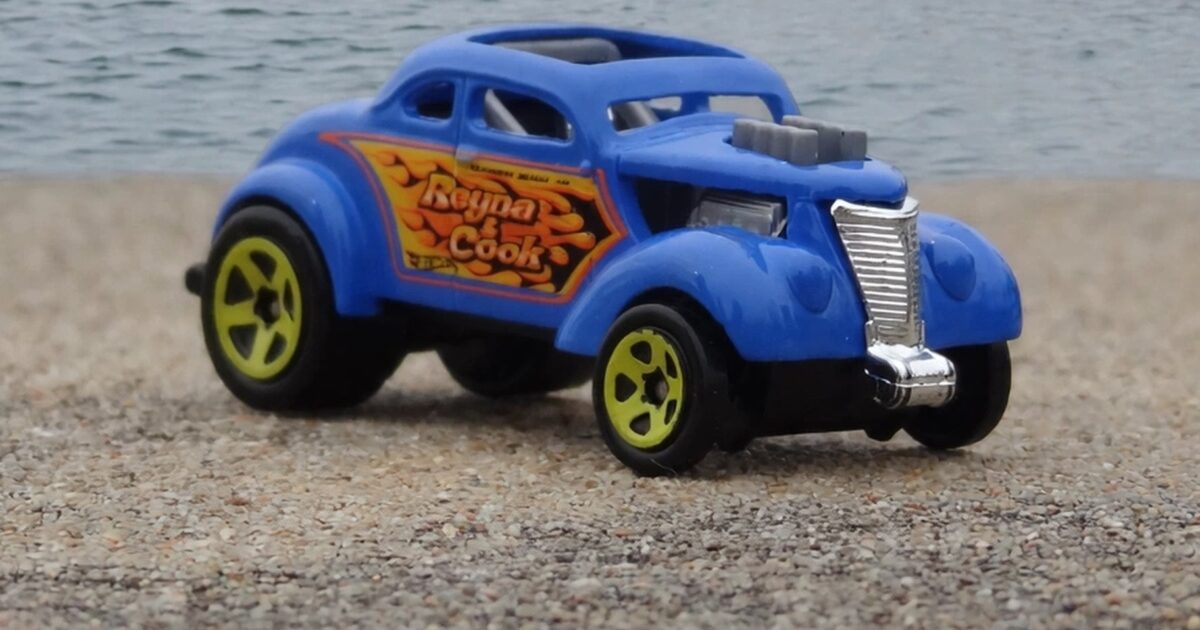
Read the panel on the side of this blue coupe. Inside a painted flame burst there are two surnames and underneath them a town and a state. Not a company. Not a sponsor. Two people and the place where they live.
That is how racers used to sign their cars, and it is the most interesting thing on a casting that has plenty else going on. A modern race car tells you who paid for it. This one tells you who actually built it.
What the Hot Wheels Pass’n Gasser is
A pre war American coupe, chopped and shortened, sitting nose high on a raised front axle with small wheels at the front and fat ones at the back. A supercharger sticks up through the hood with its intake exposed to the open air. The grille is a tall chrome shell, the fenders are rounded blisters, and the cabin has been squeezed into a narrow slot.
The body is a flat mid blue, the wheels are bright yellow with five spokes, and the only decoration is the lettered panel on each flank.
Why the names matter more than the logos
Think about what a sponsor logo on a race car actually communicates. It says somebody with money decided this team was a useful thing to be associated with. It is an endorsement, and it points away from the car toward a company.
Two surnames point the other way. They say this machine was built in a garage by people whose reputation was local, who raced against others from the same few towns, and whose entire marketing budget amounted to a sign painter and one afternoon. That culture produced the cars every custom casting still imitates.
The flame panel behind the lettering
The names sit on an orange and yellow flame burst outlined in black, the sort of thing a sign painter would lay down freehand with a brush. It is not a stripe or a modern vinyl graphic. It is hand lettering, faithfully reproduced as a tampo.
On mine the printing is sharp enough that the outline around each letter survives, which at this size is genuinely difficult. That panel is the entire visual identity of the car, and a blurred version would have left a blue coupe with nothing to say.
The blue underneath is flat and slightly chalky, closer to a shop mixed colour than to a factory finish. That suits the car. A deep metallic would have looked like money, and money is not what this vehicle is about.
The blower through the hood
A grey supercharger sits on top of the engine, pushed up through a hole cut in the hood, with the intake open to the sky. Below it you can see a hint of the engine itself in the gap.
Cutting a hole in the bodywork to let the machinery out is one of the oldest signals in this entire culture. It says the engine is more important than the body, which was literally true on cars where the hood was a formality and the motor cost more than the house it was built in.
The intake is open at the top with no filter and no scoop over it, which on a real car means the engine is swallowing whatever the track throws at it. Nobody driving one of these expected it to last the season.
Yellow wheels and the raised front
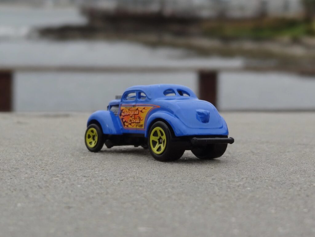
The wheels are the loudest thing after the lettering, bright yellow against mid blue, with chunky black tires at the back and narrower ones at the front.
The front axle is lifted, so the car points slightly upward. I will not spend long on why that stance exists, because I covered it when I wrote about a gold Bel Air built the same way. What matters here is that the casting commits to it fully instead of softening it into a normal ride height.
The chrome grille shell is the other detail I keep returning to. It stands upright at the front like a radiator from a much older car, and against the raised nose it makes the whole vehicle look like it is about to leave.
Fantasy casting or real car
This is a question people ask about castings like this one. The answer is that it sits in between: the body style, the stance, the blower and the lettering are all drawn from real cars, but this particular machine with these particular names was assembled by a designer instead of a racer.
That middle ground is where a lot of this brand’s best work lives, and it is the thing to understand before you start sorting a collection into real and invented. I set out the distinction in what a Hot Wheels car actually is.
Photographing a car with one good side
The lettering panel is on both flanks, and it is the only reason to look at this car. That makes the side view the shot to take, with the front three quarter angle close behind, because it catches the blower and the grille shell together.
Straight from the front it loses most of what makes it interesting. Shoot it low, side on, with the sun raking across so the flame panel lights up and the blue stays dark. My starter guide has some basics for anybody beginning to photograph their shelf.
Two names and a town
I have no idea at all who those two people were. The casting gives me a flame panel, two surnames and a coastal town, and I cannot tell you whether they ever existed or whether a designer invented them over a coffee.
It does not matter. What the lettering does is point at a world where a car carried the names of the people who built it instead of the names of the people who funded it. Every custom on my shelf descends from that arrangement, and this is the only one that says so out loud on its door.